You’ve been spending a lot of extra time at home these last few months, which is a good thing. But in that time, you may not have been able to help noticing a lot of home décor that’s just not working for you anymore.
If an upgrade or two are in the cards and your budget allows, according to Elle Décor and other design experts, here are a few home décor trends you’d be best to stay away from – they’re D for done.
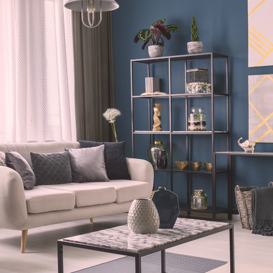
1. Geometric prints: Squares, triangles and bold lines have been a design mainstay for a decade now but they’re outstaying their welcome. What’s in instead? Chintz and other floral patterns have made a comeback.
2. Grey on grey: Like taupe before it, grey is everywhere. Bold monochromatic colours – like Hague and cobalt blue, Kelly green and Aubergine make a richer statement.
3. White doors: Standard white painted doors, trim and baseboards are safe but not very interesting. Consider leaving your walls a white or light colour and painting your doors a bold hue.
4. White baseboards and crown molding: This is another dated look. Instead, consider painting the walls, ceiling and trim the same shade for a chic look.
5. Bland bathrooms: Think of your bathroom as a hidden gem – a small space where you can experiment with a bold paint colour or wallpaper (as long as you have a strong extractor fan).
6. Conventional fireplaces: Maintaining a traditional fireplace can be a hassle. New eco-friendly alternatives are cheaper to install and easier to maintain.
7. Unconventional art: Framed art can nicely dress up a bare wall, but so can a large tapestry, wood carving or other unique art.
8. Pristine new: New store-bought items often end up looking too perfect, as like they’re meant for a magazine instead of a home to be lived in. Mixing in vintage tables, rugs or art from older eras adds layers of visual interest and feels more personal.
9. Karate-chopped pillows: Puff up your sofa pillows but stop chopping them down the middle – it looks fake.
What design trends are you absolutely sick of? Share thoughts and new design ideas with the Shop Talk blog community!
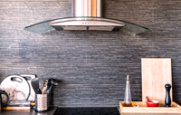
Did you know: Subway tiles are out
Kitchen subway tiles are a classic look but they’re now in every kitchen. Instead, explore a range of available shapes, textures and colour.
I am tired of the white, grey and black look, where everything looks like a black & white photo. In those trying times we need colours!!! Warm colours viva Mexico, orange, red, yellows to wake up our energy. Blues, greens, gold to create a calming effect. Anything to bring us out of this natural dead funk. .And who cares if it is in or out, we have to do what we like, not follow like sheep to described fashion.
I said the same kind of thing to my husband this very day!!
I had no idea
i really reading your information ,i gave me hints how to refresh my apartment without breaking the bank
Stop worrying about what’s trendy and do what you like
Thanks for the info! Out with the old in with the new 🙂
What trend do I hate? White on white on white. It looks sickly pale, disquieting, ghostly, waiting to be decorated. What passes for ‘farm house style’ often uses too much white. Anyway, I’ve lived on farms in the 70’s, and nothing ever looked anything like what is being called farm house decor now a days.
Thanks good tips especially the pillows.
Pretty sure the sliding barn door fad will also end soon.
Decorate with what you love.
Totally agree!!
Oh thank you about the karate chop pillow, subway tiles etc. I love an eclectic mix of vintage, antiques and modern. Works for us and along with our hot turquoise hardwood floors most people love it.
This would depend on where live. As well as money.
Two years ago I decided to renovate our home that we are renting out until July 1, 2021. A home we will be moving in next year once we sell our home that we live in. I decided back then that I would paint all the walls white, including the vaulted ceiling. I also decided to paint all baseboards window trim, and doors navy. I will probably paint the doors a bye that complements the navy. I really like blues and greens, and will use those colours in the cushions and assesories . It is an open concept, and I have already purchased a hammered copper apron sink for the kitchen. I am also considering a splash of yellow touches to add to the blues and greens. I love decorating and have had many wonderful comments from strangers in our last two homes.
I am absolutely sick of my popcorn ceilings!
All these DONTS pretty much sums up my whole house! 🙁
Sorry but I disagree with your view on some items noted above. I have seen light walls and colored doors, trim and baseboards BUT they need to be done in homes with higher ceiling heights OR your house will look choppy. You noted that Subway tiles are out BUT they will NEVER date themselves (if they are light) like most tiles out there today will do. One usually cannot change backsplashes every 7-10 years. Some bold monochromatic colors are wonderful to look at but again they could dwarf your room so you have to watch where you are putting them, especially if in a wallpaper. Sometimes, fashions in the 70’s & 80’s should stay in the 70’s-80’s. Just my opinion.
I agree that sometimes, you can paint ceiling and walls same colour,looks like the walls are taller this way…
alove the earthy green colours and white painted baseboards for easy wiping !
They make the room look centered.
I love grey of all shades, but definately need to add pops of colour to break up the
neutral ness of it!
Disagree on subway tiles. Will always be a classic and you can jazz them up by laying them in different directions or using a coloured grout
I’m against anything that would date a home that is more permanent. Like try to make your kitchen more basic than using ornate mouldings, dress it up with whatever statement you want to make You don’t want to put a particular style in that won’t easily be changed without a Reno
What absolutely bs, as a contractor and interior designer, I would not recommend following these ideas. Geometric shapes are still very much in and no one wants floral. Gray is safe yes but it’s also livable, 2 years down the road u will hate that cobalt blue, same for the doors, u won’t get annoyed at white in a few years but u will hate that blue door. Painting a room one colour on everything will drive u crazy and makes the room look smaller. Do not paint ur trim the same colour at the wall, it will look silly to u in a year. Bathrooms are normally a bit more bland so to invite relaxation, ur not going to be relaxed looking at a deep red wall, colours have meaning behind them. A real fireplace is more sellable then an electric fireplace and commonly should be the large accent on the room, not just a piece of art like the electric one look like. I will agree with number 7 as wood art pieces are very popular and anything other then paintings can add some great character to a room. Must be carful with how much vintage you add to ur space, too much and it starts looking like a run down old building, and carful when putting newer items near the vintage as it can make it look less vintage and more just needing do be replaced. And again I will agree with 9, don’t chop ur pillows unless they r vintage looking, and even then, not as much chop as ur grandma, just a light crease. Subway tiles are still a great choice for most kitchen but before u buy them just check out what other tiles there r, u might find one u like better. Over all of this the most important thing is that you like your own home, don’t care about trend as they come and go, make ur house ur home and do it how u want it
Could not agree more!!!
good to know
Where can the colours in point #2 be found, or are they just general colours?
Thanks
I always disliked subway tiles and they will never come into my house. Reason : EVERYBODY had to have them… I’m thrilled they are finally out!!
This elderly lady loved your new ideas on decorating – plus the colours!
Vanilla, oatmeal, white on white decor
Bland bland bland stark boring homes.
thanks. I am installing white doors, but may change my mind and paint them medium grey…..
thank you
I feel what’s in, (unless your going to sell), is what YOU FEEL COMFOTABLE IN.
I remember what our tour guide said when visiting a California winery. He said , “People ask me what is the best wine. I tell them, whatever taste good to you.” I believe that applys to most adventures in life. Forget about what’s in or most popular. That way, you have a clear creative screen in your brain , not being adulterated by someone else’s imposed views of what some one else considers “IN”!!! Again, I will illiterate, only if your not going to sell. Sad to say, when it comes to the dollar bill, you have to appeal to the masses😀
I feel what’s in, unless your going to sell), is what YOU FEEL MOST COMFORTABLE WITH. I remember what our tour guide said when visiting a California winery. He said, “People ask me, what is the best wine. I answer them, whatever taste good to you.” I believe that reasoning applies to most adventures in life. Forget about what’s in or most popular. That way, you have a clear creative screen in your brain, not adulterated by someone else’s imposed views of what they consider, “IN”!!! Again I will reiterate, only if your not considering selling your home. Sad to say, when it comes to the dollar bill, you have to appeal to the masses😀
i cant stand you so called design experts who think that what ever you suggest everyone must do. if someone wants to use subway tiles or have white doors throughout their house, what business is it of yours to tell them that it is passe or outdated
White kitchens beautiful but need colour.
I do not have the money to do any thing in my apartment and I live in a Manitoba housing unit
Try Habitat for Humanity’s ReStore. They have paint and other items that people have donated.
Use your imagination…ex: go to thrift stores, look at a planter…but use it as a hamper, turned upside down becomes a footstool or a table…think outside the Box!!! It’s really Fun 🥰🥰🥰
Buy two gallons of paint, two small brushes and some rollers and invite four friends over to a painting party, with coffee and donuts for a break. Pick a light colour and paint the kitchen, living room and hall. Cost is low, your friends are helping and the main area of apartment is fresh. Good Luck.
No problems
up to here with the depressing grey. been in style way too many years. its time for it to go. you could not pay me to decorate my house like a prison cell. yuck.
Try garage sales and discount places. Even the Dollar store has some nice very affordable things like candles, paintings, mirrors (which open a room up and look rich), pillows, and other arts. If you can’t afford to paint all the walls then do one feature wall. This too is a common trend. If they say you can’t paint it, just do it anyway. Even if you have to paint it back to white or whatever color when you leave, this too will be cheap and easy to do.
I’m not sure who it is that decides what is in and what is out, and that there’s necessarily A consensus on design through the years. The whole Community is not in my house touring around and checking out my curtains and wall colour. 15 years ago I did bold paint colours on the walls black window trim and Floral, when it was not necessarily in style. And now I want to change so I’m going more classic with white trim grey walls geometric pattern curtains blah blah blah, all the things that are apparently no longer in. It all comes down to taste and preference. You do whatever feels good for you. It’s your house, and you’re the one who has to see the walls and the curtains and the decor everytime you walk into a room. I don’t think that any magazine should be able to tell you what’s what, and I don’t think that anyone really cares. I just don’t get trends, and why it’s so important to people have the same thing as everybody else has at the same time as they have it. If anything, you should be looking to do the opposite of what is trending so you remain unique!
I dont have the money to do what I need its so hard and the money I make working goes on my rent and bills